

Stripes return for the first day of summer
A familiar and foreboding pattern continues to expand

As astronomical summer begins in 2024 (the summer solstice this year is just before 5pm ET on Thursday, June 20), a recurring image is popping up across the country and around the world.
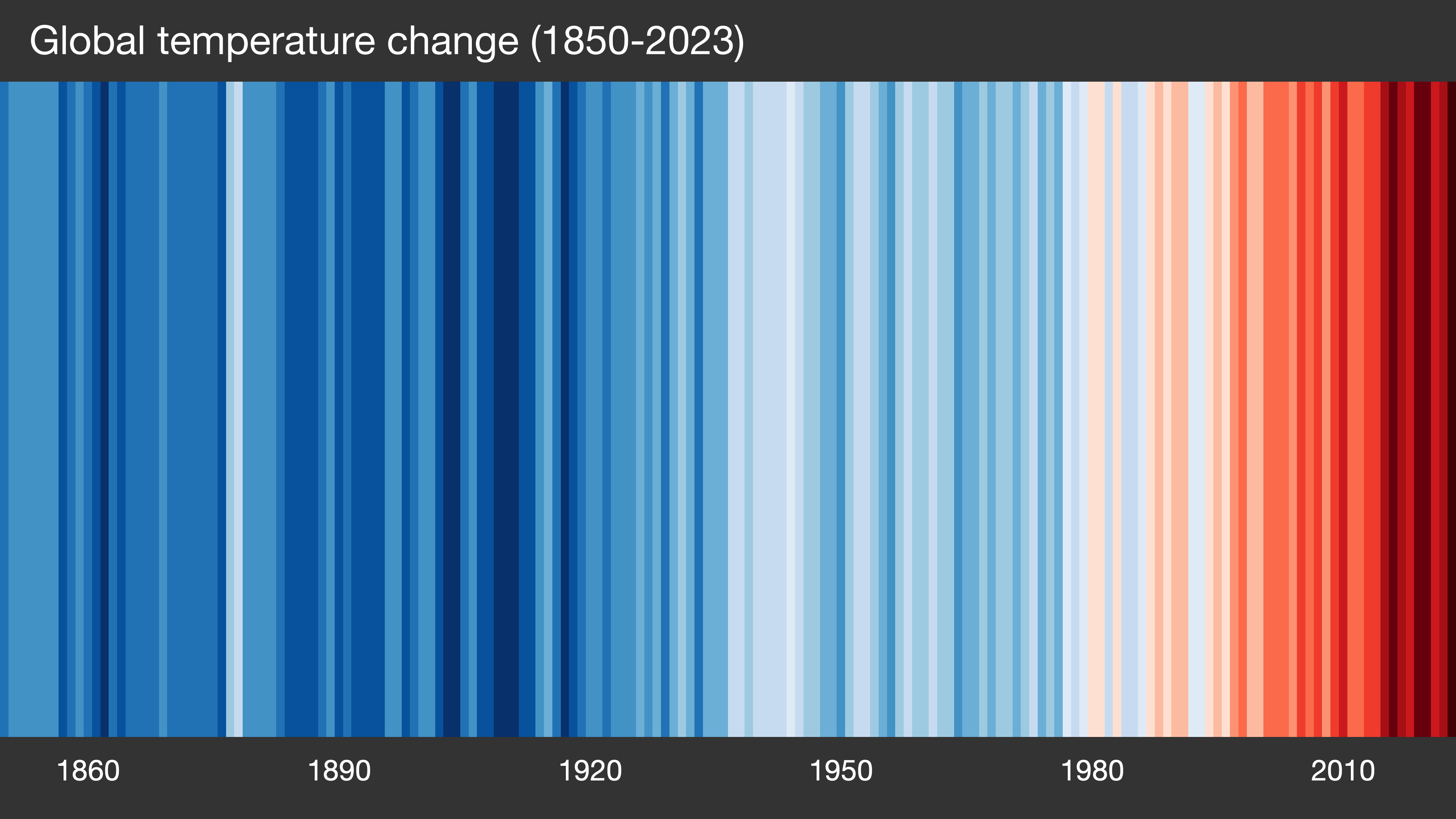
These stripes were created by Ed Hawkins, a climate scientist at the University of Reading. Originally, each stripe depicted the global average temperature each year since 1850 using data from the U.K. Meteorological Office. The color of each stripe corresponds to a year when the temperature was above the long-term average (red) or below (blue).
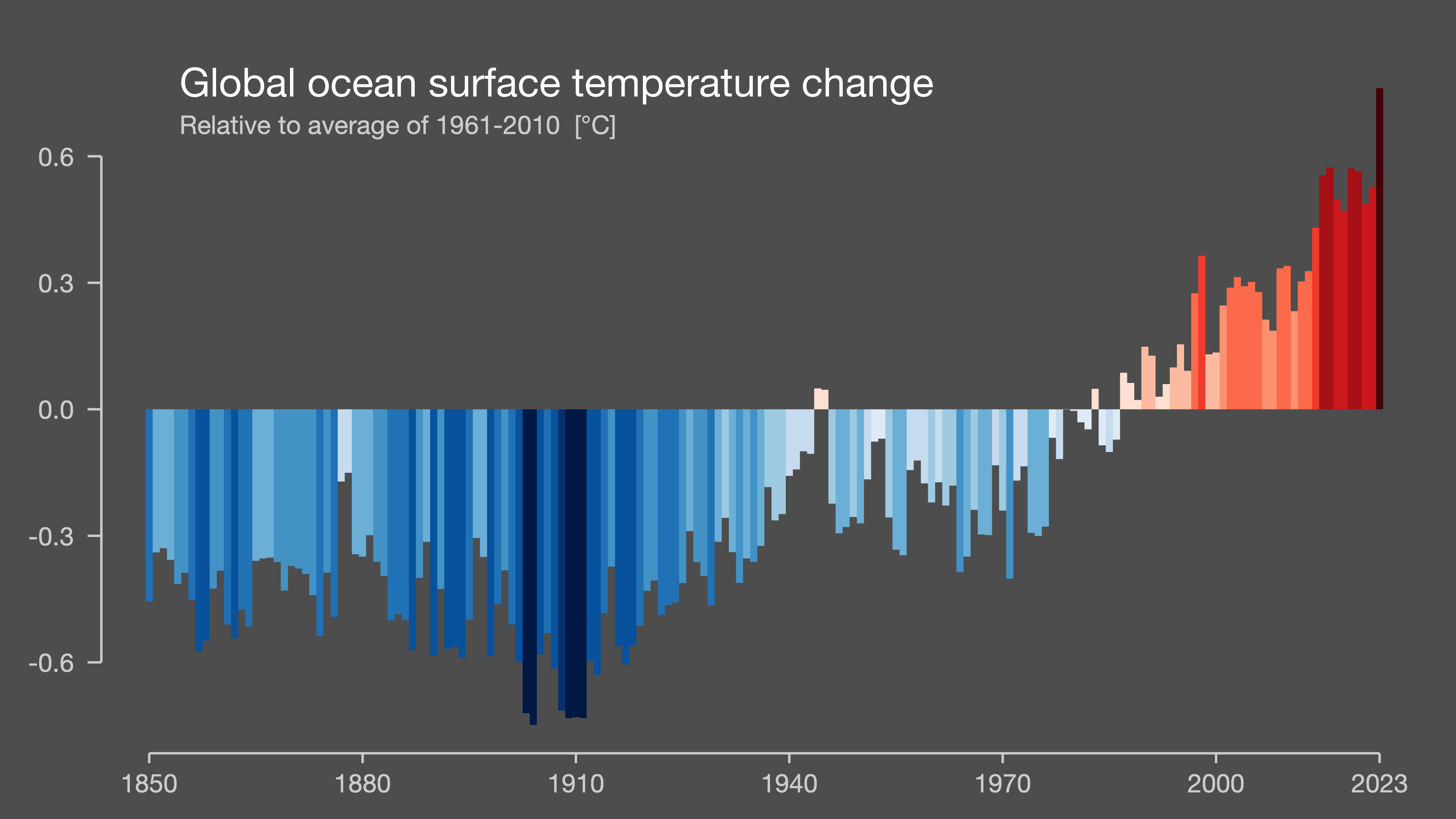
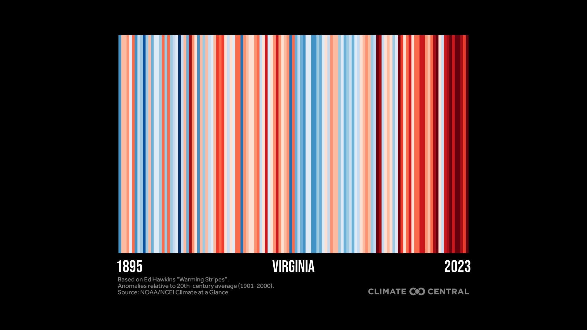
In the past several years, several different versions of the pattern have emerged. Data at national, state, and local levels can be used up to show how the temperature has changed at individual locations around the world — including in the oceans.
With few exceptions, the stripes show the gradual transition from blue to red, illustrating dramatic warming over the past few decades. And while any individual year may be warmer or cooler than average, the warming of the last 40 years dominates the signal.
After the scientific community has looked for multiple reasons for the warming — from solar output to local land use — the overwhelming evidence shows that the warming comes from the burning of fossil fuels.
Burning coal, oil, and natural gas releases carbon dioxide into the atmosphere. That gas, even in amounts that seem very small, helps keep the planet warmer. The impact is especially strong in areas that are cold to begin with and do not get a lot of sun — one of the reasons why the Arctic is warming about three to four times faster than the rest of the planet.
Evidence continues to mount. For the 14th consecutive month, global ocean temperatures have set new monthly record highs. Despite a weakening El Niño, 2024 has been the globally warmest year on record so far.
Since the late 19th century, the planet has warmed about 2°F, and current global energy and emissions policies are on track for 5.5°F of warming by 2100. However, precisely home much additional warming occurs will depend on how closely the emissions in the coming decades mirror those policies.
Every tenth of a degree matters in the long-term, as it raises the risk for longer and stronger heatwaves, more intense rainfall, and more coastal flooding. Reliable agricultural zones will continue to shift, fishing areas will become less dependable as their populations relocate, and pollen seasons will become longer with less time of the year below freezing.
However, there are some encouraging signs. Coal, which is one of the dirtiest of the fossil fuels, is being phased out as the cost of natural gas has fallen. As a result, many states have seen their emissions take on a slow decline in the last 15 years.
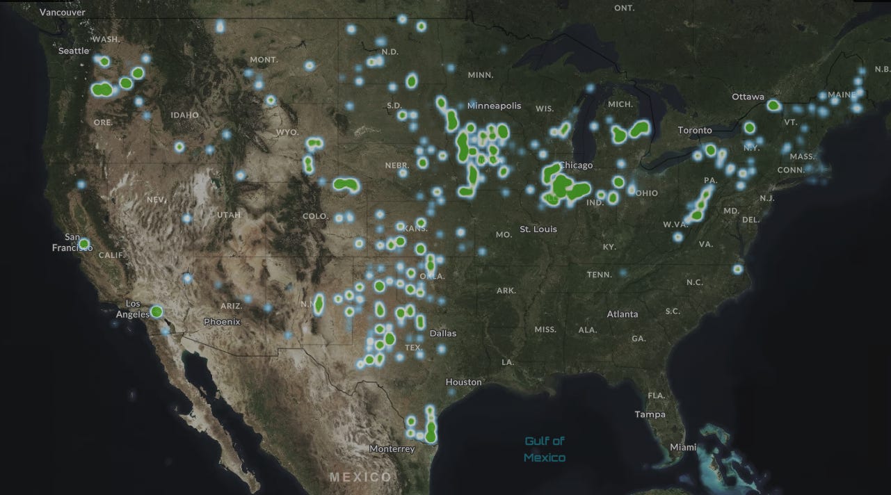
Solar and wind energy is beginning to scale upward. The Solar Energy Industries Association has are more than 6,960 major solar projects currently in their database, representing nearly 239 gigawatts of capacity.
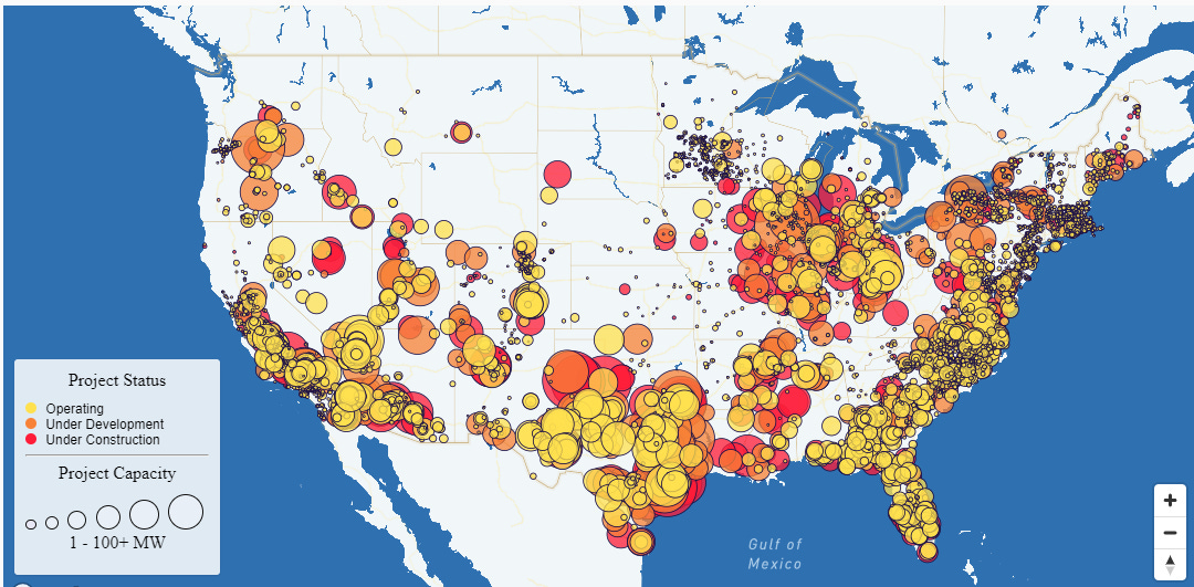
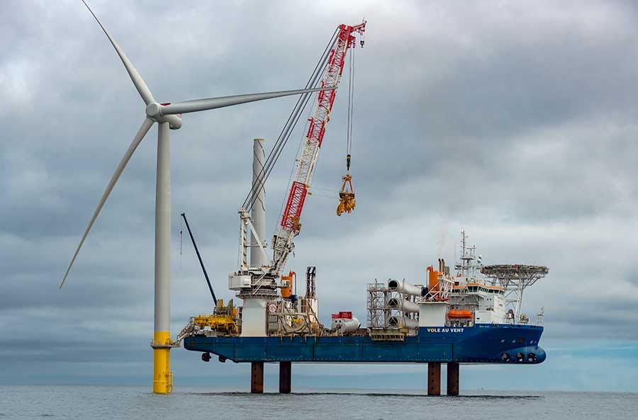
Here in Virginia, Dominion Energy continues to move forward with its Coastal Virginia Offshore Wind Project, which is expected to become operational by the end of 2026.
On land, the wind is more consistent on the Plains and in the Midwest, making it a more viable onshore option versus the Southeast, where the wind is far less reliable during the summer months.
But more work will need to be done; the concentration of carbon dioxide in the atmosphere has risen nearly 35 percent since 1958, and it continues to climb. As long as that number goes up, expect the stripes to show up every year around this time.
And the new stripes added to the image will be a deep red for several years to come.